How to Create a Dynamic Mega Menu in Squarespace 7.1: Complete Guide
Transform your Squarespace navigation with a professional mega menu. This step-by-step guide will show you exactly how to implement it, even if you're not a developer.
Essential Setup Steps
Step 1: Create Content Pages
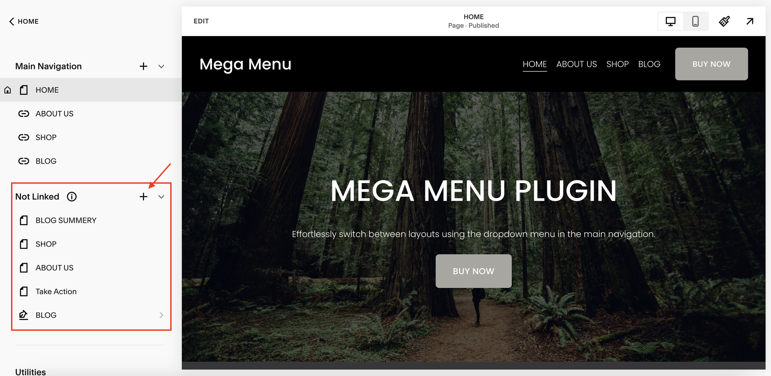
Go to your Squarespace Pages panel
Click the '+' icon in the Not Linked section
Create new pages for each mega menu dropdown (e.g., "Services Menu", "About Menu")
Design these pages with your mega menu content using Squarespace blocks
Important: Copy the URL of each page (e.g., "/services-menu", "/about-menu")
Step 2: Set Up Navigation Links
Go to your main navigation
Add menu items that will trigger the mega menus
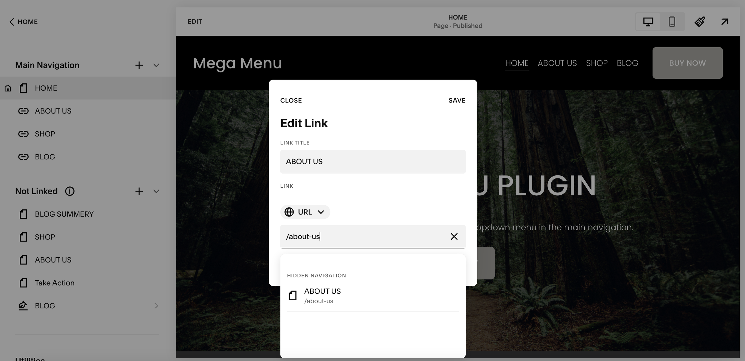
Use the exact URLs from your Not Linked pages
Example: If your menu page URL is "/about-us", your navigation link should be "/about-us"
Step 3: Add the Code
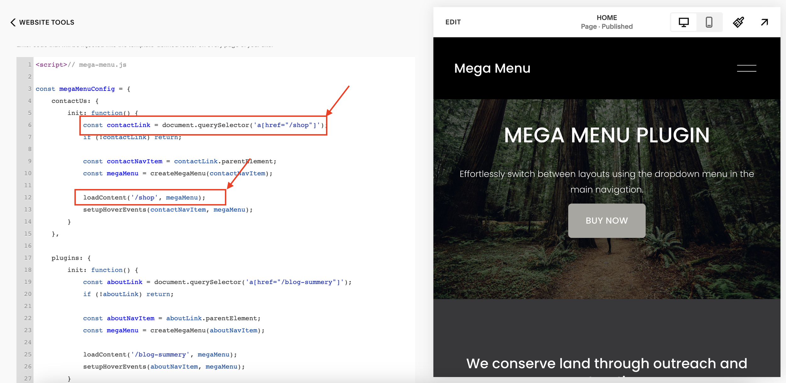
Go to Pages → Website Tools → Code Injection → FOOTER and add this code:
In JS, replace the “/LINK1” “/LINK2” “/LINK3” with your page’s link in the code.
See image for reference. Here I have used “/shop” for my shop page in the menu.
Step 4: Add the CSS
Go to Design → Custom CSS and add this code:
/* mega-menu.css */

/* ... (keep the existing base styles) ... */

/* Dropdown Arrow Styles */
.dropdown-arrow {
    display: inline-flex;
    align-items: center;
    transition: transform 0.3s ease;
}

.dropdown-arrow svg {
    display: block;
}

.dropdown-arrow.active {
    transform: rotate(180deg);
}

/* Menu Arrow Styles */
.mega-menu-arrow {
    position: absolute;
    top: -8px;
    width: 16px;
    height: 16px;
    background: white;
    transform: rotate(45deg);
    border-left: 1px solid rgba(0, 0, 0, 0.1);
    border-top: 1px solid rgba(0, 0, 0, 0.1);
    z-index: 1;
    transition: left 0.3s ease;
}

/* Update mega menu styles */
.mega-menu {
    display: none;
    position: absolute;
    top: calc(100% + 8px);
    left: 50%;
    transform: translateX(-50%);
    width: 100vw;
    max-width: 100vw;
    background: white;
    box-shadow: 0 4px 6px rgba(0, 0, 0, 0.1);
    z-index: 1000;
    padding: 0;
    border-radius: 3px;
    margin: 0 calc(-50vw + 50%);
    opacity: 0;
    visibility: hidden;
    transition: opacity 0.3s, visibility 0.3s;
}

.mega-menu.active {
    display: block;
    opacity: 1;
    visibility: visible;
}

/* Remove old arrow pseudo-elements */
.mega-menu::before,
.mega-menu::after {
    display: none;
}

/* Adjust wrapper to account for new arrow */
.mega-menu-wrapper {
    position: relative;
    max-width: 1400px;
    margin: 0 auto;
    background: white;
    border-radius: 3px;
    z-index: 2;
}

/* Navigation link styles */
nav a {
    display: inline-flex;
    align-items: center;
    text-decoration: none;
    position: relative;
}
5. Mobile Styles
Mobile styles are relatively simple. Since we only added our footer section in the folder that is within the header-display-desktop element, our folder still appears as normal on mobile, just with no content in it. So any links that we want displayed on our mobile menu, we just need to add to the folder in our main nav.
This will also add these items to the desktop dropdown, so we need to add this little bit of code to remove them.
/* Mobile styles */
@media screen and (max-width: 768px) {
    .mega-menu-arrow {
        display: none;
    }

    .dropdown-arrow {
        margin-left: auto; /* Push to right side on mobile */
    }
}
Common Issues & Solutions
Menu Not Showing
Double-check your page URLs in the code match exactly with your Not Linked pages
Make sure the code is added to the Footer injection, not Header
Verify your navigation links use the exact same URLs
Content Not Loading
Ensure your Not Linked pages are published
Check that the pages aren't password protected
Mobile Display Problems
Clear your site cache
Make sure you've added the mobile CSS
Need help? Leave a comment below!

